Weekend Assignment #104: Tell us your favorite color. Give no less than three reasons why it is so.
Extra credit: A picture that is primarily of your favorite color.
It seems to me that when I was three or four years old, my favorite color was pink. That would explain the ballerina wallpaper I was stuck with for the next ten years. My mom's favorite color was definitely blue, and that became mine, too, at least nominally. I liked our living room, with its two walls on the dark side of French blue.
By the early 1980s, though, I was heavily into red and black, at least in my clothing choices. There was Spandex and vinyl; there were rivets and zippers; but it was the color scheme that made it work. Hey, I was still in my twenties, and still thin enough to (almost) get away with it.
Nowadays, I live in a house with low-end 1950s decor. My favorite part is an area dominated by turquoise (or teal), accented by salmon and black and white. Our Cugat picture is pink with turquoise, and our no-name cityscape has a turquoise sky.

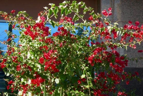
And of course, our kitchen is decorated in red. Here's one of John's birthday presents from this week: a red-rimmed clock to replace the vintage deco-style red clock that stopped keeping time.
What, you want just one favorite color? Sorry, not gonna happen. I love colors - bright colors, mostly, but the important thing is that they're fun and cheerful and varied. Reason #1: back in the 1950s and 1960s, even through into the beginning of the 1970s, all those colors, especially pinks and blues, conveyed an optimism and a sense of playfulness that was later confined mostly to children's bedrooms. I hate the white and beige world of contemporary decor and don't-upset-the-office attire. It's dull, dull, dull, with no imagination or originality or fun. That's why I love Maryanne's and Judi's always-colorful art. They don't limit themselves to the muted conformity of a limited palette.
So here we go with reason #2:
And she said...
Flowers are red, young man.
Green leaves are green.
There's no need to see flowers any other way
Than they way they always have been seen.

But the little boy said...
There are so many colors in the rainbow,
So many colors in the morning sun!
So many colors in the flower, and I see every one!
--Flowers Are Red by Harry Chapin
Flowers are red, young man.
Green leaves are green.
There's no need to see flowers any other way
Than they way they always have been seen.
But the little boy said...
There are so many colors in the rainbow,
So many colors in the morning sun!
So many colors in the flower, and I see every one!
--Flowers Are Red by Harry Chapin
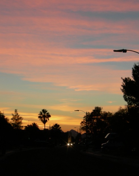
The little boy got it right. For example, here's a sunset picture from tonight, taken with one of the three "sunset" settings on my new camera:
It's not just in vintage decor that different shades of pink and blue look great together. Reason #3:
The miracle of imagination,
The marvels of Earth, Sea and Sky.
These wonders untold are ours to behold,
In the wonderful world of color.
--The Wonderful World of Color,
by Richard M Sherman and Robert B Sherman

Okay, okay. I will admit that I still have a slight preference for certain shades of blue and red. Here's my current jacket. No Spandex or studs, but it is red and black! And notice the turquoise /Leap Blue wall reflected behind it.
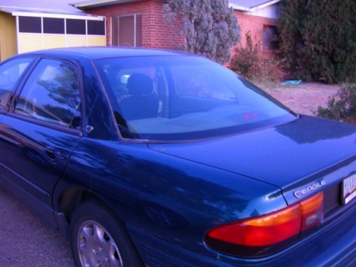
And here's my teal-colored car, photographed after sunset using the "dusk" setting on my camera. Note the red brick behind it. Those last two shots are for the extra credit.
If I apply the "at least three reasons" thing to blue, specifically the turquoise and teal part of the color range, I come up with this:
- It was my mom's favorite color, and the color of our unusual living room, which I once depicted in watercolor in a kindergarten art class.
- Turquoise is a very Arizona color, because the mineral is used extensively in native arts. And of course, the sky here is very blue, most of the time--unlike in Manlius!
- Sam Beckett's Imaging Chamber is primarily "leap blue," as is the show's main title.
- Several of Arizona's prettiest birds ae unusual shades of blue, most notably the indigo bunting.
- Blue represents both river and sky in the national symbol and royal seal of Mâvarin. (See the top of this blog.)
- It's calm and cheerful at the same time.
I'm not going to do a list of reasons for red, but I could if I had to.
Karen
3 comments:
Hi Karen
A lovely grouping of photographs as always. I went with the color red. We must have been reading each other's mind! LOL. Great clock...I LOVE it!
you left out your red and blue file folders from the previous post! lol..
I am not sure I have a favorite color.. maybe i'd say Earth tones. But not just one color either.
well, Karen, you did better than I. I avoided making an entry because I couldn't make a choice. I laughed at how you snuck in two colors! Pictures are color-rich! Jacket appears to be floating. And the reason I think I enjoyed this entry most was your reference to Harry Chapin's song, Fowers Are Red. I own most of his albums... not CDs, mind you, albums. WEll, of course, I had to go out and get the CDs when CD players made record players obsolete and impractical. I even attended one of his concerts at UGA in Athens, 1977ish. I'm a big HC fan. Bea
Post a Comment