Extra credit: Ever ignored a warning sign you should have paid attention to?

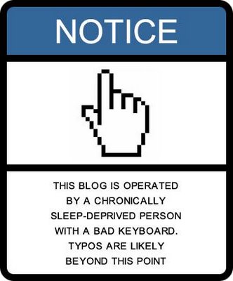
Here was my first idea for this, although it took me hours to come up with the actual wording. What can I say? I really am tired.

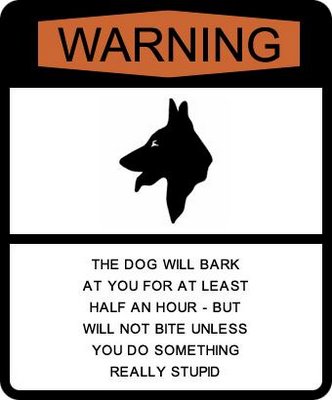
And this was my other major idea. Yes, she really does do that. I advise you to leave her alone. Eventually, if you're nice, she'll come to you.
I have to say I was less than wowed by these. So I customized them:

You're on notice! Heck, I actually had to add a period after the fact, which kind of proves my point.
 Warning signs should be yellow, don't you think? Like Tuffy.
Speaking of second attempts on graphics, John and I agreed that last night's photofied Mâvarin characters were not up to the standard of the previous entry. So I spent a couple of hours tonight trying again. Like the warning signs, I think it came out better on the second take.
I almost forgot the extra credit. I once ignored a warning sign on a newly-added traffic median and darn near totaled my car driving over it. See, until they added that traffic island, that stretch of road was part of the turn lane for the intersection ahead. Besides, the glare of the setting sun was in my eyes. Really. It was. But the main reason I ignored the sign was this: someone had already knocked it down making the same mistake. All that was left was the flattened signpost.
Karen
No comments:
Post a Comment